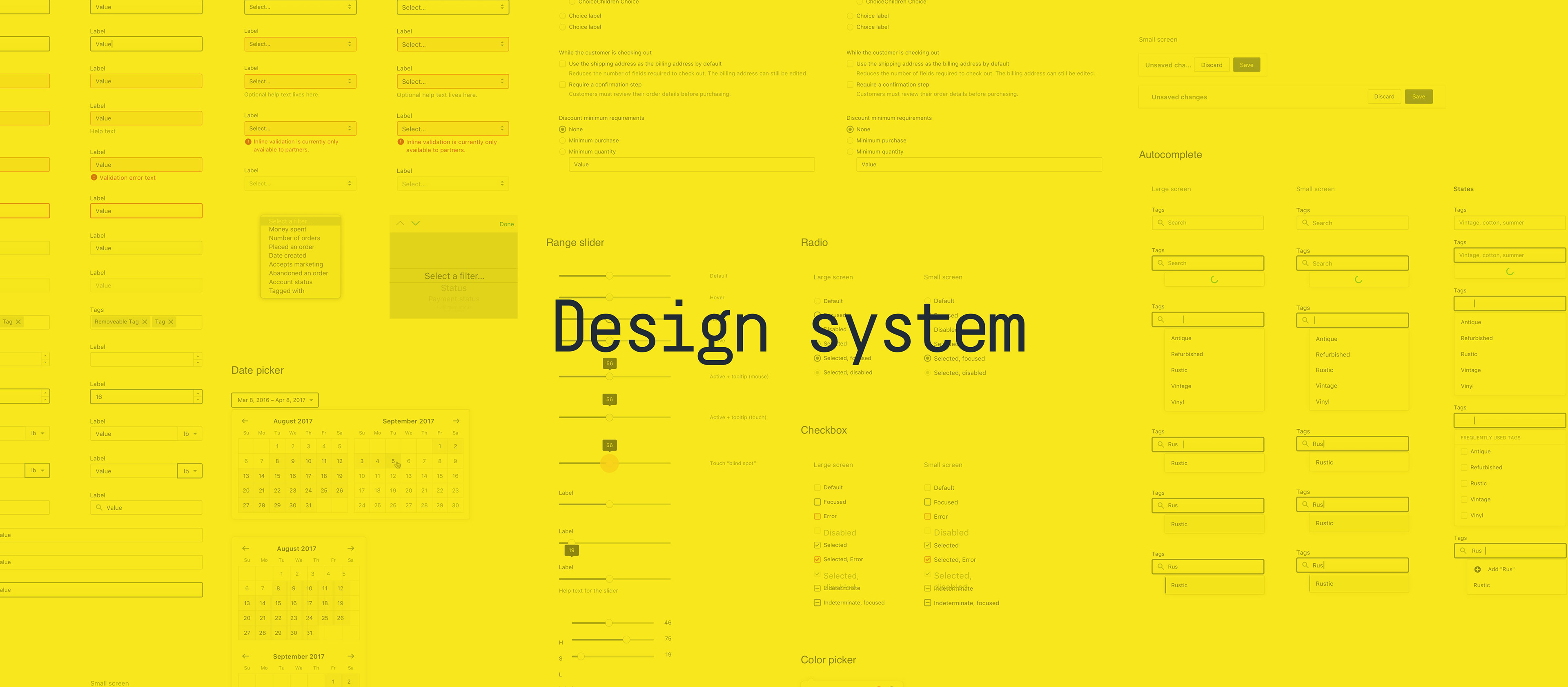
My role at Shopify was to lead design and the holistic experiences for Shopify Payments and Capital. I worked on adding new payment methods, country launches (Germany, Hong Kong, Spain, etc), redesigned a new improved the onboarding and product experience, added asynchronous payment methods support to fulfillment and made overall system changes to support multi-currency. While the majority of the projects I worked on are confidential, or not suited to be featured in a portfolio, I have chosen a few that showcases work I did on Shopify's design system.
Product onboarding
We started this project with these two questions: how can we improve the general product onboarding experience and build an improve the overall compatibility to match future needs?
After doing user research, merchant interviews, gathered feedback and insights from numerous stakeholders, we wrote down a series of goals for the success of this project:
∙ Define user cohorts and document their specific needs
∙ Instrument and create user conversion funnels
∙ Implement feedback loops across the experience
∙ Improve ergonomics, and reduce friction
∙ Build confidence in the product
∙ Create an experience that can scale with future needs
∙ Improve design system components for user onboarding
∙ Localize the product experience
As a result, we streamlined the user onboarding process reducing merchant frustration, built an holistic product experience that's compatible with their localized expectations, and made the necessary adjustments to ensure it's long lasting compatibility with the products' growth roadmap.
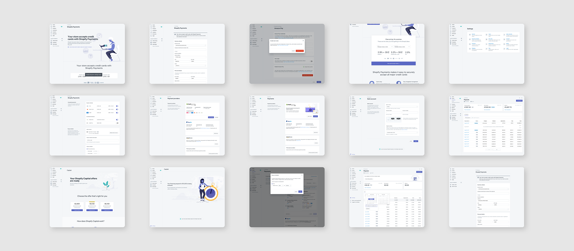
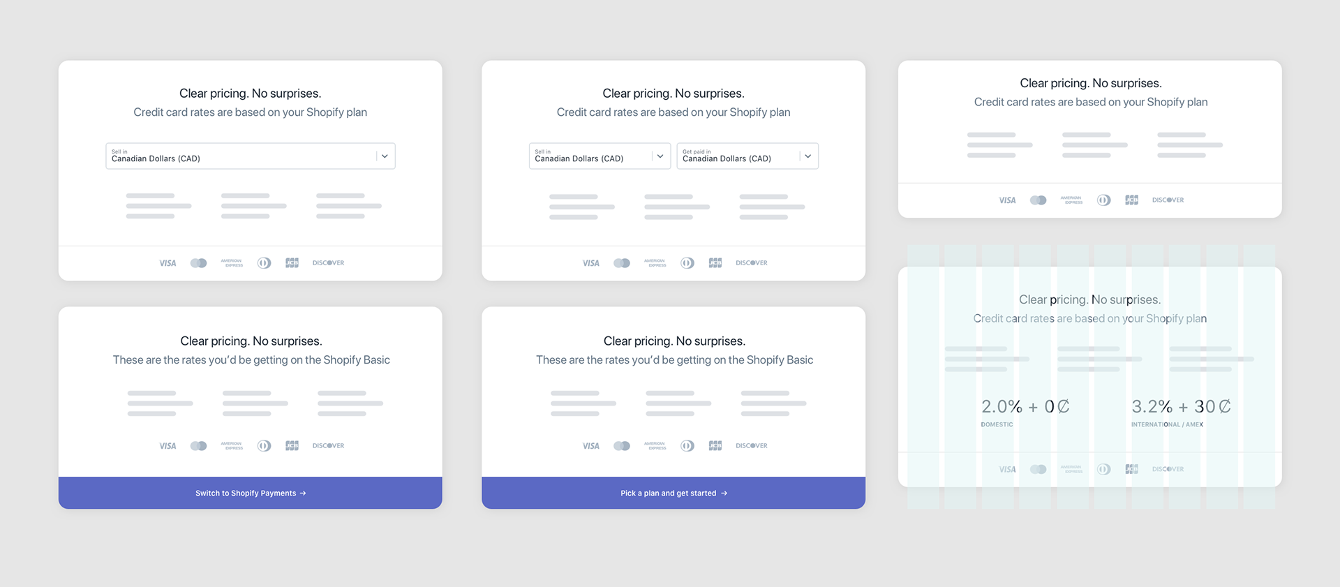
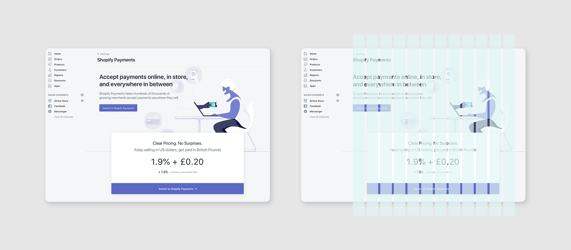
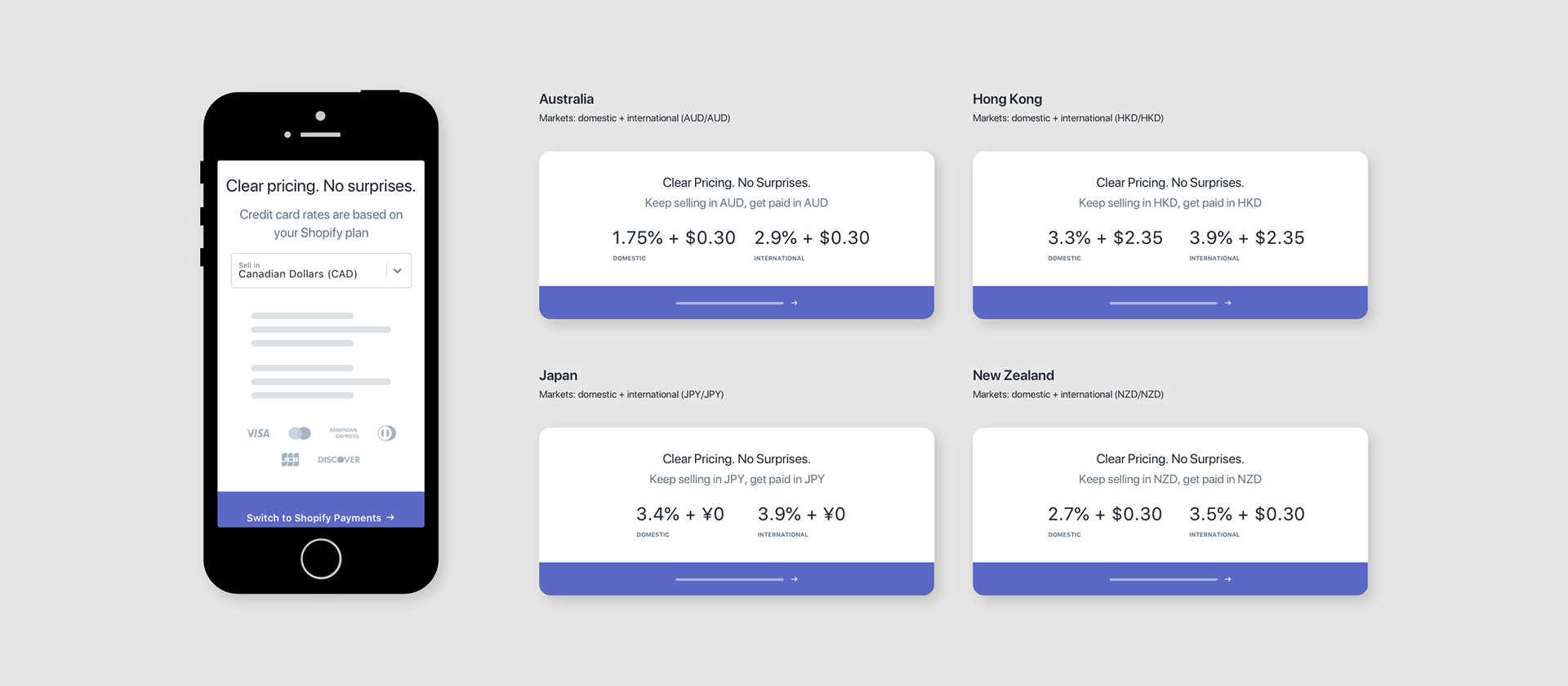
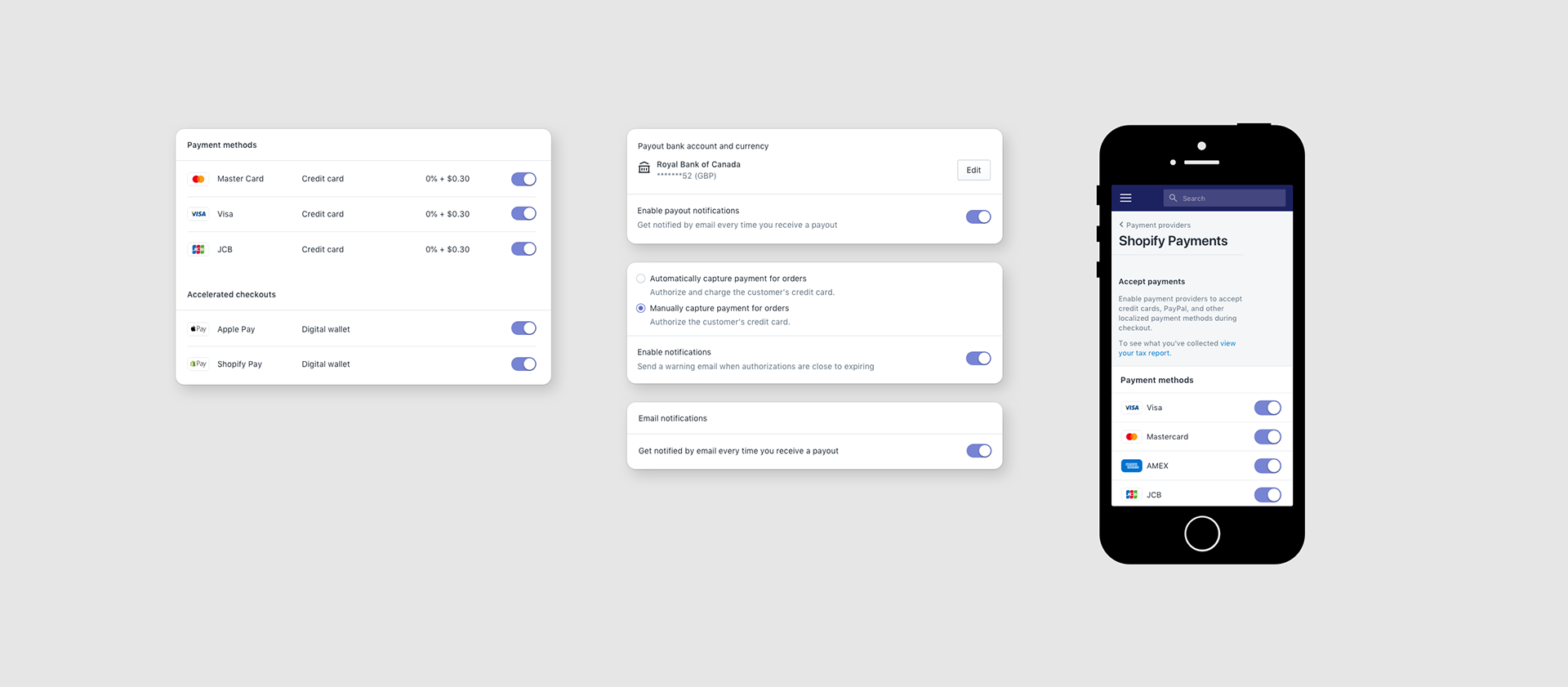
Sell pages
These pages are used inside the product to help merchants learn and onboard into new features, or services. Sell pages are used as an entry point allowing merchants the means to activate a feature unlocking new parameters in the system. They are built as a marketing tool, inside the Shopify app consolidating both marketing assets, and design system assets in one environment.
Numerous teams are using sell pages across the product, and my responsibility was to build them around a system allowing growth teams to easily test assumptions without too much engineering efforts. Based on a grid system and the concept of mutation design, these layouts are flexible, localized and simple to use making these pages a great testing ground for experiments.
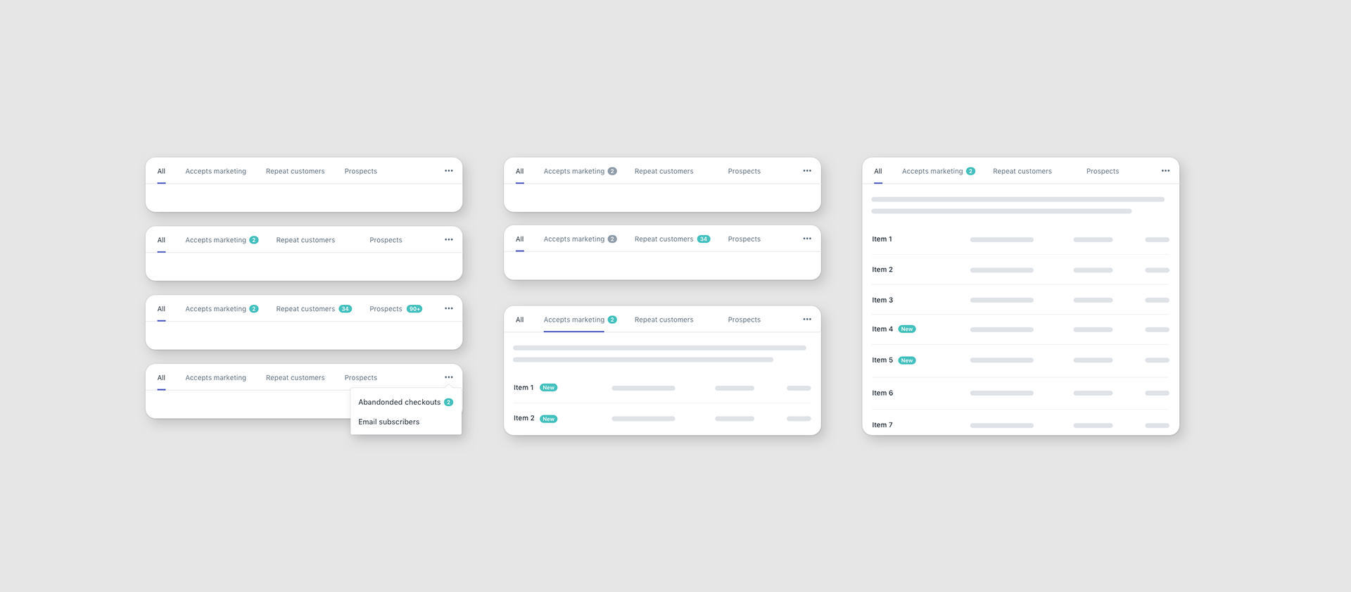
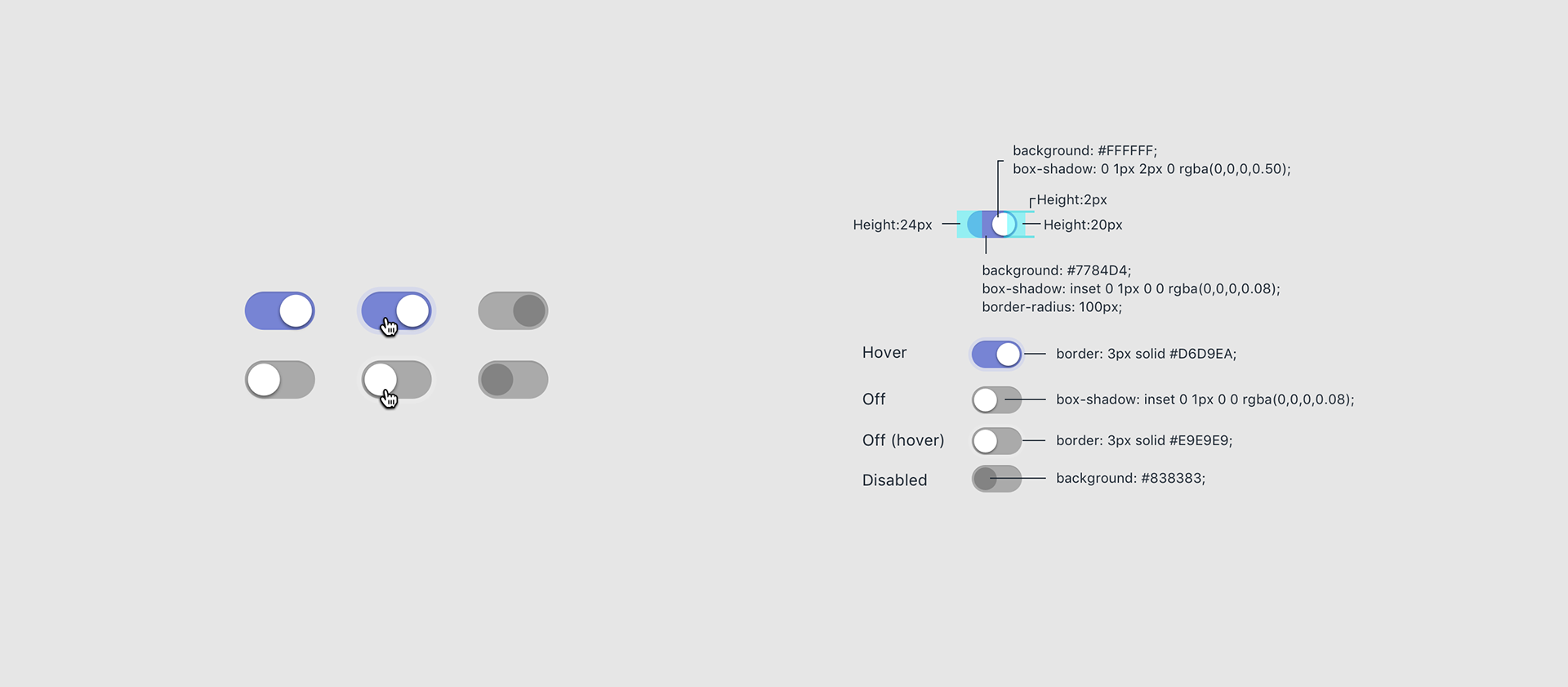
Toggles
Historically Shopify had a good reason no to use toggles because they weren't native web elements such as checkboxes, and radio buttons and required a learning curve. Many years later they became a proven and globally used pattern, especially in the mobile world. Using checkboxes for one of my project didn't make sense because I needed a component for persistent changes (e.g. turning something on/off). I decided to convince a few stakeholders it was time to start this conversation—one that would bring toggles to our design system.
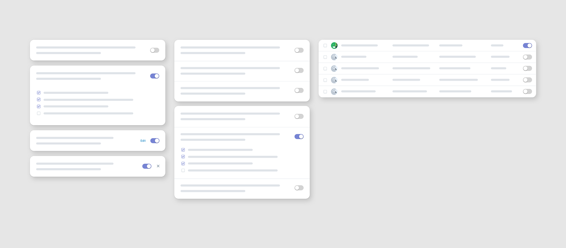
Notifications
Feature announcements are really important as they inform users something is new and should be looked at. The resource list is a commonly used pattern in Polaris used in the majority of sections, but didn't have a proper pattern that informed merchants when a change was made on their behalf. This pill is using a different colour which is intended be in contrast with the interface making sure the it's catches the attention of the user. It's compatible with our resource list, tab components and can be used as a number, or as a simple "new" tag.